![]()
![]()
The Challenge
Transforming LCU to connect better with community and inspire growth.
Leominster Credit Union (LCU) sought a deep and impactful rebrand that aligned with its core mission to serve the community, envisioned future growth, and reflected its commitment to delivering exceptional financial services in a truly inclusive and meaningful manner. The challenge was to create a brand identity that not only resonated with existing members but also attracted new ones by communicating warmth, accessibility, and community spirit.

Process
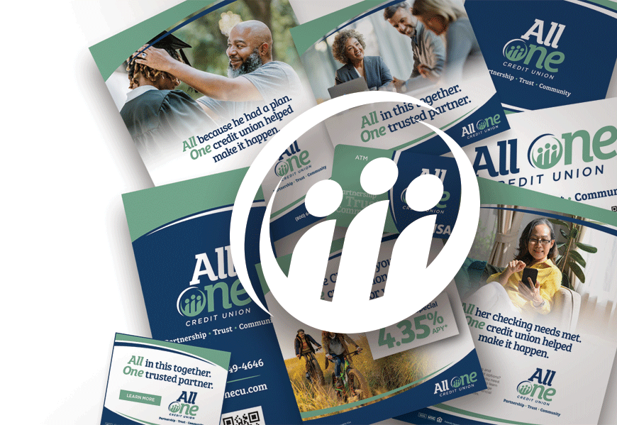
Building an inclusive identity that unites us all – ALL ONE CREDIT UNION
Understanding that evolution is key to relevance, we embarked on a comprehensive rebranding journey to craft a message that felt particularly inviting and significant. This involved rigorous research, numerous iterations, and extensive focus groups with members and community stakeholders. After in-depth discussions and careful evaluation, we reached a name that encapsulated LCU’s essence: All One Credit Union.
This name embodies their unwavering commitment to inclusivity and community, signifying that everyone—regardless of background—has a place at All One.
Execution
Infusing collaboration and color with design that touches hearts.
With a powerful new name in hand, we set to work on building a comprehensive brand universe. A vibrant color palette was meticulously designed to evoke feelings of trust, warmth, and community spirit—reflecting the core values of All One Credit Union.
The logo design was a pivotal aspect of this transformation. Central to its concept, we incorporated stylized figures within the “O,” representing the harmony and support inherent in inclusivity. This clever design element illustrated the idea that every individual contributes to the strength of the community.
Every component of the new branding was thoughtfully crafted to communicate collaboration and support among employees, members, and the broader community. Our goal was to foster a familial atmosphere that emphasized togetherness and mutual success.